The UI Side
UI and Themeing


Approach
Folder Structure
.
└── ui/
    ├── atoms/
    │   └── Button/
    │       ├── Button.component.js
    │       ├── Button.stories.js
    │       ├── Button.style.css
    │       ├── Button.test.js
    │       └── Button.type.js
    ├── molecules
    ├── organisms
    ├── skeletons
    ├── templates
    └── theme.css
THis Folder structure organizes UI components into different levels of abstraction, following the Atomic Design methodology. Here’s a detailed explanation of the structure:
Root Folder: ui/
This is the main directory containing all UI-related files and subfolders.
Subfolders
atoms/- Contains the smallest, reusable UI components (e.g., buttons, inputs, icons).
- Example: The
Buttonfolder includes all files related to theButtoncomponent:Button.component.js: The main implementation of the button component.Button.stories.js: Storybook file to document and test the button visually.Button.style.css: CSS file for styling the button.Button.test.js: Unit tests for the button component.Button.type.js: Type definitions (e.g., PropTypes or TypeScript types) for the button.
molecules/- Contains components made by combining multiple atoms. For example, an input field with a label or a search bar.
organisms/- Larger, more complex components formed by combining molecules and atoms. Examples include navigation bars or forms.
skeletons/- Placeholder components used during loading states to improve user experience.
templates/- Defines page layouts by arranging organisms and other components in a structured way.
theme.css- A global stylesheet that manages themes, such as colors, fonts, and spacing across the application.
Architecture
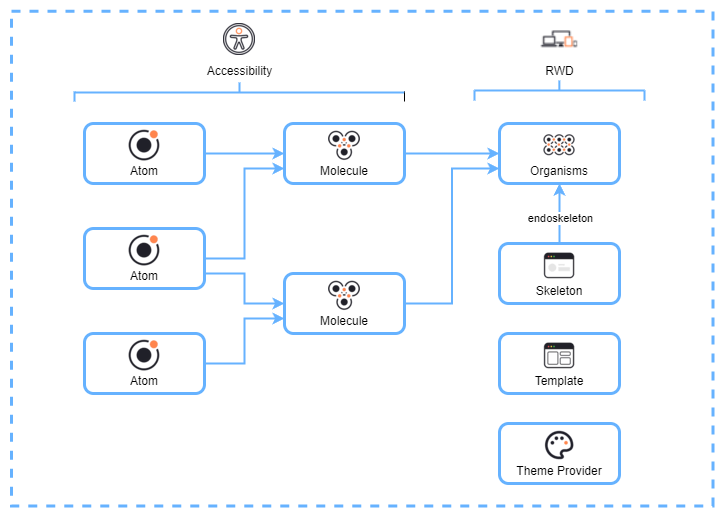
This diagram visually represents how UI components are organized in Atomic Design:
- Atoms
- The smallest building blocks (e.g., buttons, inputs).
- Accessible and reusable.
- Molecules
- Created by combining atoms to form more complex elements (e.g., search bars or labeled inputs).
- Organisms
- Larger, functional components formed by combining molecules (e.g., a header with navigation links).
- Skeleton
- Placeholder UI used during loading states to improve user experience.
- Template
- Defines the structure of pages by arranging organisms in a layout.
- Theme Provider
- Ensures consistent styling and theming across the application.