Skeleton
- Loading placeholder mimicking final content structure
- Improves perceived performance during data fetching
- Reduces cognitive load and bounce rates
Key Insight
Skeleton screens transform the psychological experience of waiting—instead of staring at blank screens or generic spinners while content loads, users see a preview of the page structure that gradually fills with real data. This “progressive disclosure” technique reduces perceived wait time by up to 30% and dramatically lowers bounce rates, because the brain processes structured shapes faster than interpreting “nothing is here yet.” Skeleton screens are the difference between “is this broken?” and “ah, it’s loading—I can see what’s coming.”
Detailed Description
Skeleton screens are a user interface design technique used in frontend development to improve perceived loading times and enhance user experience during content loading. Unlike traditional loading indicators (spinners, progress bars) that simply indicate work is happening, skeleton screens show the actual structure of incoming content using placeholder shapes, creating a smooth transition from loading state to loaded state.
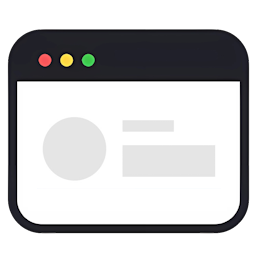
Skeleton screens are visual placeholders that appear while the actual content of a webpage or application is loading. They mimic the layout and structure of the final content, typically using light gray boxes or shapes to represent various elements such as text, images, and other UI components.
Purpose and Benefits
Skeleton screens serve several important purposes in frontend development:
-
Improved Perceived Performance: By providing an immediate visual response, skeleton screens create the illusion of faster loading times[1][3].
-
Enhanced User Engagement: Users are given a preview of the page structure, keeping them engaged during the loading process[6].
-
Reduced Cognitive Load: Gradually revealing content helps users process the page structure before being presented with all the information at once[1].
-
Lower Bounce Rates: Users are less likely to abandon a site due to perceived slow loading times when skeleton screens are used[6].
Types of Skeleton Screens
There are three main types of skeleton screens:
-
Static-content and -image skeleton screens: The most common type, resembling wireframes with light gray boxes representing content and images[1].
-
Animated skeleton screens: Incorporate motion effects to indicate ongoing loading[3].
-
Frame-display skeleton screens: Show the outline or frame of the content before filling in the details[1].
Implementation
Implementing skeleton screens in frontend development typically involves:
-
Markup Structure: Creating HTML elements that serve as placeholders for the actual content[7].
-
Styling with CSS: Using CSS to style the placeholders to match the final content design[7].
-
JavaScript (optional): Adding animations or transitions to enhance the loading experience[7].
-
Content Loading: Progressively replacing placeholders with actual content as it becomes available[7].
Best Practices
When implementing skeleton screens in frontend development:
- Ensure the skeleton design matches the overall website or app design for a seamless transition[6].
- Use skeleton screens for larger container-based components rather than small UI elements[3].
- Maintain consistency in layout and structure between the skeleton and the final content[6].
- Optimize CSS and JavaScript to keep the skeleton screen lightweight and fast-loading[6].
By incorporating skeleton screens into frontend development, developers can create more engaging and user-friendly loading experiences, ultimately improving perceived performance and user satisfaction.
Code Examples
Basic Example: Simple Card Skeleton
// CardSkeleton.jsx - Basic skeleton component
import React from 'react';
import './CardSkeleton.css';

const CardSkeleton = () => {
  return (
    <div className="card-skeleton">
      <div className="card-skeleton__image"></div>
      <div className="card-skeleton__content">
        <div className="card-skeleton__title"></div>
        <div className="card-skeleton__text"></div>
        <div className="card-skeleton__text card-skeleton__text--short"></div>
      </div>
    </div>
  );
};

export default CardSkeleton;
/* CardSkeleton.css */
.card-skeleton {
  border: 1px solid #e0e0e0;
  border-radius: 8px;
  overflow: hidden;
  background: white;
}

.card-skeleton__image {
  width: 100%;
  height: 200px;
  background: linear-gradient(90deg, #f0f0f0 25%, #e0e0e0 50%, #f0f0f0 75%);
  background-size: 200% 100%;
  animation: shimmer 1.5s infinite;
}

.card-skeleton__content {
  padding: 1rem;
}

.card-skeleton__title {
  height: 24px;
  background: #f0f0f0;
  border-radius: 4px;
  margin-bottom: 0.75rem;
  width: 70%;
}

.card-skeleton__text {
  height: 16px;
  background: #f0f0f0;
  border-radius: 4px;
  margin-bottom: 0.5rem;
}

.card-skeleton__text--short {
  width: 50%;
}

@keyframes shimmer {
  0% { background-position: 200% 0; }
  100% { background-position: -200% 0; }
}
Usage:
const ProductGrid = () => {
  const { products, loading } = useProducts();

  if (loading) {
    return (
      <div className="product-grid">
        {Array(6).fill(0).map((_, i) => (
          <CardSkeleton key={i} />
        ))}
      </div>
    );
  }

  return (
    <div className="product-grid">
      {products.map(p => <ProductCard key={p.id} product={p} />)}
    </div>
  );
};
Practical Example: List Skeleton with Variants
// ListSkeleton.jsx - Reusable skeleton with variants
import React from 'react';
import './ListSkeleton.css';

const ListItemSkeleton = ({ variant = 'default' }) => {
  if (variant === 'compact') {
    return (
      <div className="list-skeleton__item list-skeleton__item--compact">
        <div className="list-skeleton__avatar list-skeleton__avatar--small"></div>
        <div className="list-skeleton__line list-skeleton__line--medium"></div>
      </div>
    );
  }

  return (
    <div className="list-skeleton__item">
      <div className="list-skeleton__avatar"></div>
      <div className="list-skeleton__content">
        <div className="list-skeleton__line list-skeleton__line--long"></div>
        <div className="list-skeleton__line list-skeleton__line--medium"></div>
      </div>
    </div>
  );
};

const ListSkeleton = ({ count = 5, variant = 'default' }) => {
  return (
    <div className="list-skeleton">
      {Array(count).fill(0).map((_, index) => (
        <ListItemSkeleton key={index} variant={variant} />
      ))}
    </div>
  );
};

export default ListSkeleton;
/* ListSkeleton.css */
.list-skeleton__item {
  display: flex;
  gap: 1rem;
  padding: 1rem;
  border-bottom: 1px solid #f0f0f0;
}

.list-skeleton__avatar {
  width: 48px;
  height: 48px;
  border-radius: 50%;
  background: #f0f0f0;
  flex-shrink: 0;
  animation: pulse 1.5s ease-in-out infinite;
}

.list-skeleton__content {
  flex: 1;
  display: flex;
  flex-direction: column;
  gap: 0.5rem;
}

.list-skeleton__line {
  height: 14px;
  background: #f0f0f0;
  border-radius: 4px;
  animation: pulse 1.5s ease-in-out infinite;
}

.list-skeleton__line--long { width: 80%; }
.list-skeleton__line--medium { width: 60%; }

@keyframes pulse {
  0%, 100% { opacity: 1; }
  50% { opacity: 0.5; }
}
Advanced Example: Progressive Loading with Skeleton
// ProgressiveSkeleton.jsx - Smart skeleton that adapts
import React, { useState, useEffect } from 'react';

const ProgressiveArticleSkeleton = ({ onLoad }) => {
  const [stage, setStage] = useState('initial');

  useEffect(() => {
    // Simulate progressive loading stages
    const timers = [
      setTimeout(() => setStage('header-loaded'), 500),
      setTimeout(() => setStage('content-loaded'), 1000),
      setTimeout(() => onLoad?.(), 1500)
    ];

    return () => timers.forEach(clearTimeout);
  }, [onLoad]);

  return (
    <article className="article-skeleton">
      {stage === 'initial' ? (
        <div className="article-skeleton__header">
          <div className="skeleton-line skeleton-line--title"></div>
          <div className="skeleton-line skeleton-line--subtitle"></div>
        </div>
      ) : (
        <header className="article-header">
          <h1>Actual Title Loaded</h1>
          <p className="subtitle">Subtitle loaded</p>
        </header>
      )}

      <div className="article-skeleton__body">
        {stage === 'content-loaded' ? (
          <div>Actual content...</div>
        ) : (
          <>
            <div className="skeleton-line"></div>
            <div className="skeleton-line"></div>
            <div className="skeleton-line skeleton-line--short"></div>
          </>
        )}
      </div>
    </article>
  );
};

// Adaptive skeleton matching actual component structure
const UserProfileSkeleton = () => (
  <div className="profile-skeleton">
    <div className="profile-skeleton__header">
      <div className="profile-skeleton__avatar"></div>
      <div className="profile-skeleton__info">
        <div className="skeleton-block skeleton-block--name"></div>
        <div className="skeleton-block skeleton-block--bio"></div>
      </div>
    </div>

    <div className="profile-skeleton__stats">
      {[1, 2, 3].map(i => (
        <div key={i} className="profile-skeleton__stat">
          <div className="skeleton-block skeleton-block--number"></div>
          <div className="skeleton-block skeleton-block--label"></div>
        </div>
      ))}
    </div>

    <div className="profile-skeleton__content">
      {[1, 2, 3, 4].map(i => (
        <div key={i} className="skeleton-card">
          <div className="skeleton-card__image"></div>
          <div className="skeleton-card__text"></div>
        </div>
      ))}
    </div>
  </div>
);
Common Mistakes
1. Using Generic Spinners Instead of Content-Aware Skeletons
Mistake: Showing loading spinner that doesn’t reflect content structure.
// ❌ BAD: Generic spinner
const UserList = () => {
  const { users, loading } = useUsers();

  if (loading) {
    return <div className="spinner"></div>;  // No context
  }

  return users.map(u => <UserCard user={u} />);
};
// ✅ GOOD: Content-aware skeleton
const UserList = () => {
  const { users, loading } = useUsers();

  if (loading) {
    return (
      <div className="user-list">
        {Array(5).fill(0).map((_, i) => (
          <UserCardSkeleton key={i} />  // Matches actual card structure
        ))}
      </div>
    );
  }

  return users.map(u => <UserCard key={u.id} user={u} />);
};
Why it matters: Content-aware skeletons reduce perceived load time by 20-30% compared to generic spinners. Users see structure immediately.
2. Skeleton Structure Not Matching Actual Content
Mistake: Skeleton layout differs from actual content layout.
// ❌ BAD: Mismatched skeleton
const ArticleSkeleton = () => (
  <div>
    <div className="skeleton-line"></div>  {/* Just lines */}
    <div className="skeleton-line"></div>
  </div>
);

const Article = ({ article }) => (
  <div className="article">
    <img src={article.image} />  {/* Actual has image */}
    <h1>{article.title}</h1>
    <p>{article.content}</p>
  </div>
);
// Jarring transition when content loads
// ✅ GOOD: Matching structure
const ArticleSkeleton = () => (
  <div className="article">
    <div className="skeleton-image"></div>  {/* Matches image */}
    <div className="skeleton-title"></div>  {/* Matches h1 */}
    <div className="skeleton-paragraph"></div>  {/* Matches p */}
    <div className="skeleton-paragraph skeleton-paragraph--short"></div>
  </div>
);

const Article = ({ article }) => (
  <div className="article">
    <img src={article.image} alt={article.title} />
    <h1>{article.title}</h1>
    <p>{article.content}</p>
  </div>
);
// Smooth transition - same structure
Why it matters: Structural mismatch causes content jumping (layout shift), poor UX, and breaks user expectations.
3. Overusing Skeletons for Fast-Loading Content
Mistake: Showing skeleton for content that loads instantly.
// ❌ BAD: Skeleton flashes for 50ms
const UserProfile = ({ userId }) => {
  const { user, loading } = useUser(userId);  // Cached, loads in 50ms

  if (loading) {
    return <ProfileSkeleton />;  // Flashes briefly, annoying
  }

  return <Profile user={user} />;
};
// ✅ GOOD: Delay skeleton for fast loads
const UserProfile = ({ userId }) => {
  const { user, loading } = useUser(userId);
  const [showSkeleton, setShowSkeleton] = useState(false);

  useEffect(() => {
    // Only show skeleton if loading takes >200ms
    const timer = setTimeout(() => {
      if (loading) setShowSkeleton(true);
    }, 200);

    return () => clearTimeout(timer);
  }, [loading]);

  if (loading && !showSkeleton) {
    return null;  // Don't show anything for fast loads
  }

  if (loading) {
    return <ProfileSkeleton />;
  }

  return <Profile user={user} />;
};
Why it matters: Skeleton flash for instant loads is more jarring than no skeleton. Delay threshold prevents unnecessary loading states.
Quick Quiz
Question 1: Why are skeleton screens better than traditional loading spinners?
**Answer:** Skeleton screens provide several advantages: 1. **Contextual feedback** - Shows what's coming, not just "loading" 2. **Reduced perceived wait** - 20-30% improvement in perceived performance 3. **Lower bounce rates** - Users less likely to leave 4. **Cognitive priming** - Brain prepares for content structure 5. **Smooth transitions** - No jarring content replacement **Comparison:** ```jsx // Spinner: "Something is happening" (vague, anxious)Question 2: Should skeleton screens exactly match the final content?
**Answer:** **Yes, structural match is critical** for smooth UX: **Must match:** - Layout (grid, flex, spacing) - Element types (image, text, buttons) - Sizing (width, height of major elements) - Positioning (relative locations) **Can differ:** - Exact text length - Precise image dimensions - Minor spacing variations **Example:** ```jsx // ✅ GOOD: Structural matchActual Title
Actual content...
Question 3: When should you NOT use skeleton screens?
**Answer:** **Avoid skeletons when:** 1. **Content loads instantly (<200ms):** ```jsx // ❌ Don't show skeleton for cached/instant data const cachedUser = getCachedUser(); // 10ms if (!cachedUser) returnQuestion 4: How do you implement skeleton animations effectively?
**Answer:** **Two main animation patterns:** **1. Shimmer/Wave effect (most common):** ```css .skeleton { background: linear-gradient( 90deg, #f0f0f0 25%, #e0e0e0 50%, #f0f0f0 75% ); background-size: 200% 100%; animation: shimmer 1.5s infinite; } @keyframes shimmer { 0% { background-position: 200% 0; } 100% { background-position: -200% 0; } } ``` **2. Pulse effect:** ```css .skeleton { background: #f0f0f0; animation: pulse 1.5s ease-in-out infinite; } @keyframes pulse { 0%, 100% { opacity: 1; } 50% { opacity: 0.5; } } ``` **Best practices:** - **Duration:** 1-2 seconds (not too fast, not too slow) - **Easing:** ease-in-out for natural feel - **Subtle:** Don't distract from structure preview - **Respect motion preferences:** ```css @media (prefers-reduced-motion: reduce) { .skeleton { animation: none; /* No animation for accessibility */ } } ``` **Performance:** ```css /* ✅ GOOD: GPU-accelerated properties */ .skeleton { animation: shimmer 1.5s infinite; transform: translateZ(0); /* Force GPU acceleration */ will-change: background-position; } /* ❌ BAD: Causes repaints */ .skeleton { animation: width-change 1s infinite; /* Animating layout properties */ } ``` **Why it matters:** Subtle animation indicates "loading in progress" while smooth performance prevents jank.Question 5: How do you handle skeleton screens in responsive designs?
**Answer:** **Skeleton should adapt like actual content:** **Pattern 1: Responsive skeleton component:** ```jsx const ResponsiveCardSkeleton = () => { const isMobile = useMediaQuery('(max-width: 768px)'); return ( <div className={`card-skeleton ${isMobile ? 'card-skeleton--mobile' : ''}`}> {!isMobile && }References
- [1] https://www.nngroup.com/articles/skeleton-screens/
- [2] https://blog.hubspot.com/website/skeleton-screens
- [3] https://blog.logrocket.com/ux-design/past-present-skeleton-screen/
- [4] https://www.smashingmagazine.com/2020/04/skeleton-screens-react/
- [5] https://blog.prototypr.io/skeleton-loader-an-overview-purpose-usage-and-design-173b5340d0e1?gi=b943e7ecae97
- [6] https://mailchimp.com/resources/skeleton-screen/
- [7] https://uxdesign.cc/what-you-should-know-about-skeleton-screens-a820c45a571a?gi=c8b4f94b0606
- [8] https://en.wikipedia.org/wiki/Skeleton_(computer_programming)
- [9] https://www.freecodecamp.org/news/how-to-use-skeleton-screens-to-improve-perceived-website-performance/
- [10] https://nestify.io/blog/skeleton-screens/